Tuesday, April 11, 2017
The bittersweet end
Wow I didn't know how soon this day would come. It feels like just yesterday I was deciding what my magazine would even embody. Now I am completely done and boy have I come a long way. To be honest I am extremely delighted with the way my magazine turned out ,I put a great deal of work and effort and it paid off. I learned a tremendous amount of the hard work and dedication that goes into creating a magazine. Thank you for participating on this journey and I hope you've enjoyed. Stay tuned to see my final result of my magazine.
Sunday, April 9, 2017
The Reason Behind My Magazine
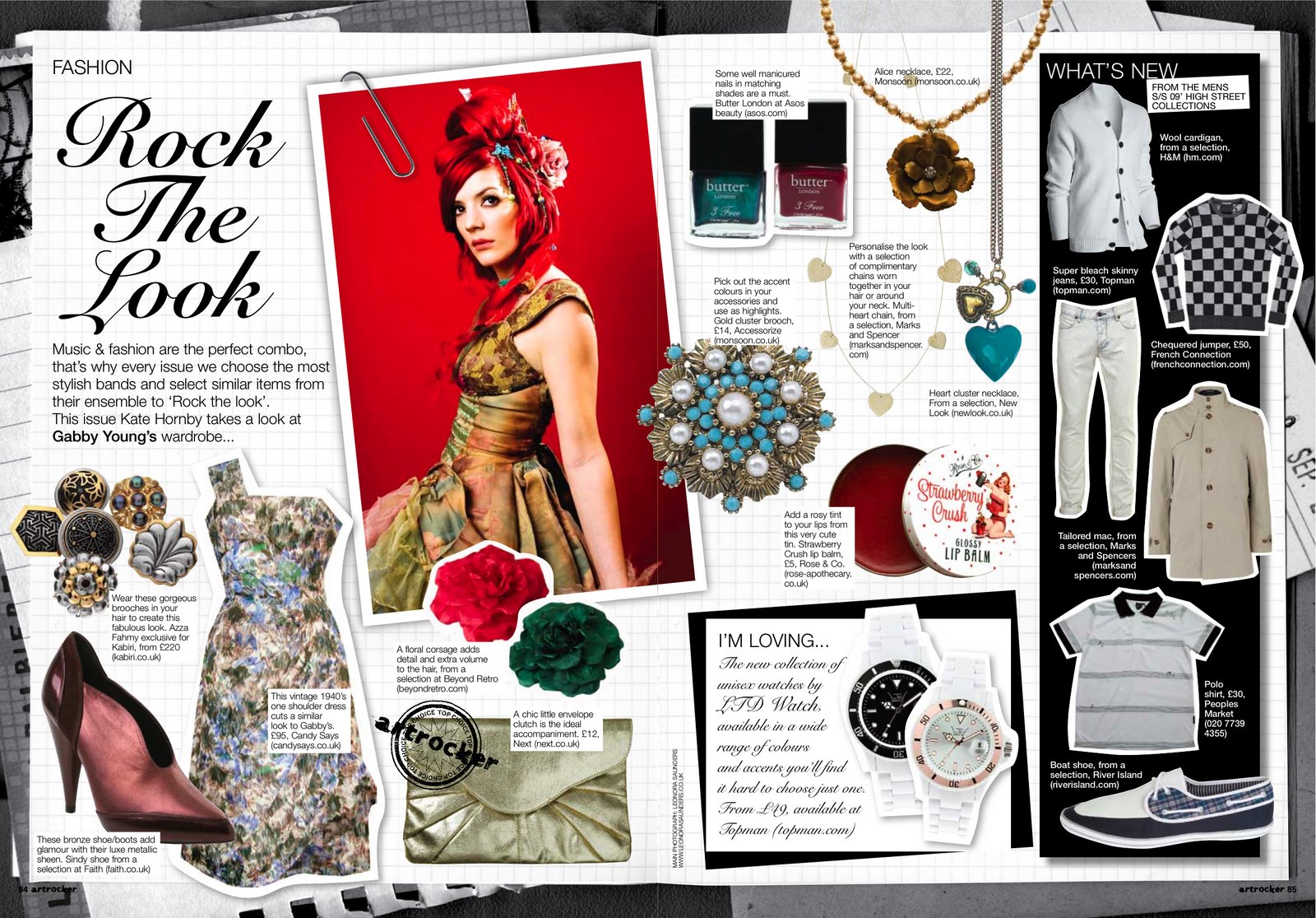
I am very happy with my magazine because I believe that it looks elegant yet it still has the girly touch. Since I did a beauty magazine I didn't conform to majority of beauty magazines, instead of focusing on a beautiful model I decided to focus on the products themselves. For example in my photos I used scrapbook paper as my background and I placed the product in front of it as if the product was the model. I did this because beauty magazines go off of the beauty of the person but they portray that the beauty is because of the products, so instead of basing it off beautiful people I use the beauty of the products. I go more in depth in my ccr as to why I chose to do this.
CCR Part 2
My ccr is a bit repetitive. I have not listened to examples of a ccr since the last time. So I believe after looking at a few I'll be able to make mine better and have everything that is needed. I'm just not sure if I should gradually add the questions. I don't know if I should get them out of the way and answer all at once or instead separate it, into different parts through my ccr.
Saturday, April 8, 2017
CCR
I've begun working on my ccr but I have not yet finished. When I started to record but it's difficult to have a whole run through without any screw ups. I've made a script to make it easer I but yet it still isn't easy to have a good run through with no interruptions I plan to finish up on Monday. I'll keep you updated with more details.
Sunday, April 2, 2017
Coming to an end
Hello! I am just going to jump straight into things, so for my double page spread it seems a bit too young so I’ve decided to turn down a notch on the amount of pink that was incorporated into my double page spread. My Double page spread is again appealing to roughly all of the ages in my target audience because it includes fun makeup for teens and adults as well as some great beauty products that are great for all skin types. It also includes great beauty products for your skin as well as hair. Since we did have two added extra days to the deadline I decided to hold off on starting the ccr until Wednesday which leaves me with about 6 days to write my script and record me and my magazine. If I wrote a script the video will flow better and I would not need to edit it as much, and it would not take long to produce. I am going to have my magazine in front of me and start from the bottom of the page and explain how and why I did the things that I did and how it fits well with my target audience. So after that as I’m writing my script it will be easier and clearer to understand.
The advertisement
Welcome back again!! Now for my advertisement it is scrapbook paper as the background with a toner as the product standing on top of the paper. The writing is only on the bottom with a cute little saying about the product. Now the only thing about that is that it does not include a picture of a person. But I believe that since it is only a toner it is not noticeable and a person cannot really display the use of a toner unlike it being a mascara you can notice it but it’s not the same with a toner. The magazine is about the products itself and how it reacts to each and everyone who tries it and not so much on how beautiful people are. That is also why my cover does not feature a person but the products themselves. Since my target audience begins at 15 and ends at 35 I believe a toner can be versatile. It works for girls who are just starting to dip their toes into the beauty world and as well for who have known about the beauty world for a while and need a spritz of rejuvenation. My advertisement is beside my table of contents. Which leads me to writing less in my table of contents and not having as many titles, but after looking at other projects it doesn't seem to be a problem.
Saturday, April 1, 2017
It's coming together
Welcome back to the blog. The project is coming along quite well and the cover page I believe to be very bright and uplifting. Now for the storylines I was researching all types of beauty magazines and I came to the realization that almost all have a storyline with numbers in the title for example “75 fabulous finds” or “101 to be the best you” so I figured that it would be fitting to include one of those into my magazine. Mine is “35 Fabulous finds. After reviewing my magazine I feel as if it does not resemble a typical magazine it seems like a card rather than a magazine cover, I’m happy with the result and don’t want to change it.
Sunday, March 26, 2017
Very excited!
Welcome! I’ve been working on my magazine and after careful review I came to the realization that the color of each page don’t seem to match but I believe that it won’t really matter. I am planning to finish up my entire magazine by the end of this week so that I can start with the CCR this weekend. I will share more of my magazine in my following blog posts. At the moment I am tweaking things up until I am happy with the outcome. I will share screenshots of the magazine as well mini comments on how and why I did the things that I did. My magazine's name is officially Beautylicious. I feel as if the name perfectly suits my magazine overall because it is cute and it also goes with the magazine itself. I am happy how it’s coming out, stay tuned to get an insider of my magazine!
I think I'm happy
This weekend has been pretty eventful for my magazine. I’ve created my cover page but i’m not sharing it yet because I am very indecisive with the outcome of it and I still want to tweak it bit more but the main theme is there and I am very happy with it. As for my table of contents I have the outline of it,
It’s similar to this but it looks too plain but I don’t know what else to add or what photos to add but I will finish that up tomorrow and hopefully it looks better and with more pictures.
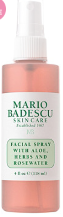
For my advertisement I am going to use this product and change the name.
For my double page spread i’ve reviewed about 7 products, the outline is still a big foggy the same as the table of contents. But the theme is there.
Thursday, March 23, 2017
Photoshoot time!
Welcome back! It’s been awhile since I’ve last posted but I have been continuously working. So I’ve had a photoshoot! I think for starting out I did a pretty good job. Now I spoke about my cover page and I am making it similar to this:
I used the idea of the wooden board but instead of using the food I randomly placed the products on the wooden board, I’ve been on the hunt for a colorful background but I couldn't find one. So as you can tell I ditched the idea of the marble, one because it was more convenient and two it’s cheaper to use something that I already own. Now back to the pictures that I took, to be honest it came out very well. My idea for this magazine is to have random pops of colors but keep the magazine overall clean and simple.
For my double page spread it will be a review of each product presented it will be a beauty must-haves 2017. For the pictures of each product I bought scrapbook paper to use as the background of the product being photographed with another paper on the bottom with a different design to give the photo a nice touch of color and dimension.
The outline itself of the double page spread is still unknown but I am starting on creating the outline this upcoming weekend.
PI found this website called canva and it helps create the outline of the magazine and with the editing of the of the pictures.
Saturday, March 18, 2017
lights camera picture
Tomorrow I am going to have a “photoshoot”, now I use this term very loosely because I have the feeling only people who can actually take pictures can use this term. All jokes aside I am nervous for the outcome of this because I hype up this idea in my head but the reality of it is a disaster. For my table of contents I don’t think I am going to include any pictures because I want it to be as minimal as can be.
I like this idea but it looks a little hard to read but the idea is there. For my magazine it looks too simple since I already am using an abundance of marble on the double page spread I believe that using this concept will look good as well as using a pop of color to brighten the pages up.
I am excited for tomorrow because all of my thoughts will become a reality and i’m very intrigued to see the end result so that I can start to put everything all together. Now for my advertisement I have no idea what I will use I think I will use a product that consists of simple packaging that way it’s easier to change the logo and make it mine, I just don’t know how I am going to incorporate it into my double page spread.
All marble
Now for my double page spread I am going to do a beauty must haves and it would just basically review the makeup and say why it was a good product and who it is best for. Now since I am taking all of the pictures myself and I am not let’s say a professional photographer I don’t want to include too many pictures because I am afraid it would come out looking bad. So I am going to keep to pictures to a minimum when displaying each product. I like the idea of mini add-ons like little post its and mini paperclips attached to the text.

The first double page spread seen above looks too messy for me and the look for this magazine is simple yet pretty with random pops of color. Since my target audience starts off at 15, I believe that the mini add ons would make it more appealing to them and look more youthful.
For the double page spread when displaying the products I’m going to have a marble background behind each product that I am “reviewing”.
I think I like this
Welcome back to my blog, after receiving insight from the beloved Mrs.Stoklosa i’ve come to the conclusion that I am changing up my magazine. Instead of restricting myself and only focusing on makeup i’ve decided to expand and also include other beauty products. I believe this will be able to not only broaden my audience but also be easier to have more content.

My target audience will aim towards females of the middle socio economic status between the ages of 15-35.
My idea for the cover page is to have a piece of tile like marble or wood like in the photo and have the products scattered and have a colorful painting in the background I like the idea its nice simple yet aesthetically pleasing.
Saturday, March 11, 2017
And so the research begins
So I was reconsidering the cover page but I don't think I will stick with it. For it being the first week of this project, the hardest part about it is the commitment. I have about a million and one ideas flowing through my head but yet I cannot stick to one. I am still going back and forth for my cover page I was thinking I could have the product (Huda beauty Rose gold textured shadows palette) and do what I talked about initially without the black and white and have the person being photographed hold it to their face as if that was part of their face like this:


Or I could just go plain and simple and feature the product and have a nice background behind it with good lighting and with editing incorporated into the photo, like this:

But using the product(Huda beauty Rose gold textured shadows palette). Now after researching I came across a few ideas that I could use for the double page spread. Some that I thought I could do was what makeup looks go well for certain eyes or makeup hacks for foundation or makeup hacks in general. Thats where I'm at right now with that. The product that I will be creating is not necessarily difficult to come up with it's again it's deciding what would be best for me and what I see fit for the magazine.
For the table of contents, I was thinking I could write out a list of ideas that I would like to possibly feature as the double page spread and use those as my table of contents. The best one would obviously be the double page spread. I think what I'm most nervous about is that I will have a certain idea in my head but once I start creating it, it will not even dare to compare what I had thought of initially. My goal for next week is to officially know what I am doing for my cover page and what my double page spread will consist of. After that is over and done with I will be able to properly go along with the layout of the magazine as well as colors and what not. That is what I have for this week, come back again next week to read what my latest thoughts are!
Too cheesy?
So during the course of this week I've done much planning on deciding which route I would like to take and what would be best for me. So I am officially saying that I've come to the conclusion that I will be doing a magazine about makeup. I am happy I decided to go on this route because today in 2017 there are a plethora of people who have turned towards makeup and there is always something new to learn each day.
Now for my cover page I've boggled with a few ideas but the one that most stuck out to me was using this makeup palette:
Now for my cover page I've boggled with a few ideas but the one that most stuck out to me was using this makeup palette:

So my initial idea was using this makeup palette and have the person being photographed put it to their face and have only their lips and the rest of their face showing. I was thinking that the photograph could be in black and white and the lips would be the only thing that would extract color. But after some consideration and consultation of a friend I came to the conclusion that the idea of the black and white was tacky and cheesy. Then she gave me the idea that I could use the same picture concept but instead of using the black and white I should go forth with the enhancement of color on the lips so that they could stick out. I was also thinking that I could also enhance the color of the eyes as well as eyeshadow since that is the product that is being displayed on the cover page. Those were some of the ideas that I was boggling with. I have it pictured in my head but I don't know if what is in my head will come out well on the magazine.
Now for the layout of my magazine I have no idea what route I am going to choose. I am blanking very hard on this because I cannot picture anything at this very moment since I am just starting to put this together. Maybe since I am featuring this makeup palette (Huda beauty Rose gold textured shadows palette) I could incorporate those colors throughout my entire magazine. I am not setting that in stone because I don't want it to be redundant and I don't want people to get sick of the colors used throughout the magazine so that could be a thought. Now for the actual content of my magazine I have no idea what I want to do for that but, I know I will have an article featuring the product (Huda beauty Rose gold textured shadows palette) but I don't know if it could be a review of the product or makeup must-haves or even makeup hacks using that product as well as others. There are so many ideas flowing through my head and I have no idea what I should stick with and which ones I should right off the bat ditch. I think for the first week of working on this project thus far I am not far along at all. But I believe next week I will hopefully have a clearer understanding of what I want to have on my double page spread. But for now these are my thoughts.
The beginning of my journey!
Hello my name is Florencia Bergner and I am writing a blog to inform you on the process that I will partake in during the journey of creating a magazine! I am very excited yet extremely nervous for this project. I am excited to see what I can accomplish and create but also very nervous due to the fact that it is very easy to mess up. I've had a few ideas in mind but I will save that for my next post. I am blocked on the name of the magazine I have no idea what I want that to be yet but I know I will come up with something. I am going towards the route of makeup but I don't necessarily know what I want to include. Since this is my first time creating a magazine and I am excited to find out what will unfold. At the end of this project I will have much more compassion for creators of magazines because of all the hard work they dedicate in order for them to publish the best content. Anyways I have many ideas but I think I have one in mind that will play out nicely. Well thank you for reading and I hope you are as excited as I am to see what I come up with. Check in weekly to see my updates and what I will create!
Subscribe to:
Posts (Atom)