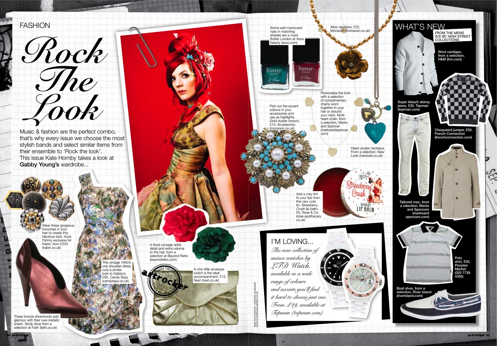
Welcome back again!! Now for my advertisement it is scrapbook paper as the background with a toner as the product standing on top of the paper. The writing is only on the bottom with a cute little saying about the product. Now the only thing about that is that it does not include a picture of a person. But I believe that since it is only a toner it is not noticeable and a person cannot really display the use of a toner unlike it being a mascara you can notice it but it’s not the same with a toner. The magazine is about the products itself and how it reacts to each and everyone who tries it and not so much on how beautiful people are. That is also why my cover does not feature a person but the products themselves. Since my target audience begins at 15 and ends at 35 I believe a toner can be versatile. It works for girls who are just starting to dip their toes into the beauty world and as well for who have known about the beauty world for a while and need a spritz of rejuvenation. My advertisement is beside my table of contents. Which leads me to writing less in my table of contents and not having as many titles, but after looking at other projects it doesn't seem to be a problem.
Sunday, April 2, 2017
Saturday, April 1, 2017
It's coming together
Welcome back to the blog. The project is coming along quite well and the cover page I believe to be very bright and uplifting. Now for the storylines I was researching all types of beauty magazines and I came to the realization that almost all have a storyline with numbers in the title for example “75 fabulous finds” or “101 to be the best you” so I figured that it would be fitting to include one of those into my magazine. Mine is “35 Fabulous finds. After reviewing my magazine I feel as if it does not resemble a typical magazine it seems like a card rather than a magazine cover, I’m happy with the result and don’t want to change it.
Sunday, March 26, 2017
Very excited!
Welcome! I’ve been working on my magazine and after careful review I came to the realization that the color of each page don’t seem to match but I believe that it won’t really matter. I am planning to finish up my entire magazine by the end of this week so that I can start with the CCR this weekend. I will share more of my magazine in my following blog posts. At the moment I am tweaking things up until I am happy with the outcome. I will share screenshots of the magazine as well mini comments on how and why I did the things that I did. My magazine's name is officially Beautylicious. I feel as if the name perfectly suits my magazine overall because it is cute and it also goes with the magazine itself. I am happy how it’s coming out, stay tuned to get an insider of my magazine!
I think I'm happy
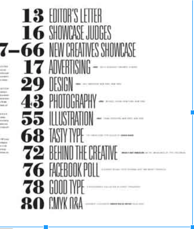
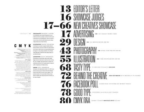
This weekend has been pretty eventful for my magazine. I’ve created my cover page but i’m not sharing it yet because I am very indecisive with the outcome of it and I still want to tweak it bit more but the main theme is there and I am very happy with it. As for my table of contents I have the outline of it,
It’s similar to this but it looks too plain but I don’t know what else to add or what photos to add but I will finish that up tomorrow and hopefully it looks better and with more pictures.
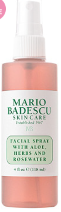
For my advertisement I am going to use this product and change the name.
For my double page spread i’ve reviewed about 7 products, the outline is still a big foggy the same as the table of contents. But the theme is there.
Thursday, March 23, 2017
Photoshoot time!
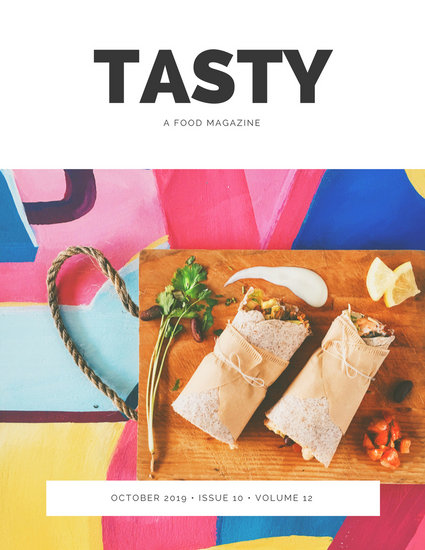
Welcome back! It’s been awhile since I’ve last posted but I have been continuously working. So I’ve had a photoshoot! I think for starting out I did a pretty good job. Now I spoke about my cover page and I am making it similar to this:
I used the idea of the wooden board but instead of using the food I randomly placed the products on the wooden board, I’ve been on the hunt for a colorful background but I couldn't find one. So as you can tell I ditched the idea of the marble, one because it was more convenient and two it’s cheaper to use something that I already own. Now back to the pictures that I took, to be honest it came out very well. My idea for this magazine is to have random pops of colors but keep the magazine overall clean and simple.
For my double page spread it will be a review of each product presented it will be a beauty must-haves 2017. For the pictures of each product I bought scrapbook paper to use as the background of the product being photographed with another paper on the bottom with a different design to give the photo a nice touch of color and dimension.
The outline itself of the double page spread is still unknown but I am starting on creating the outline this upcoming weekend.
PI found this website called canva and it helps create the outline of the magazine and with the editing of the of the pictures.
Saturday, March 18, 2017
lights camera picture
Tomorrow I am going to have a “photoshoot”, now I use this term very loosely because I have the feeling only people who can actually take pictures can use this term. All jokes aside I am nervous for the outcome of this because I hype up this idea in my head but the reality of it is a disaster. For my table of contents I don’t think I am going to include any pictures because I want it to be as minimal as can be.
I like this idea but it looks a little hard to read but the idea is there. For my magazine it looks too simple since I already am using an abundance of marble on the double page spread I believe that using this concept will look good as well as using a pop of color to brighten the pages up.
I am excited for tomorrow because all of my thoughts will become a reality and i’m very intrigued to see the end result so that I can start to put everything all together. Now for my advertisement I have no idea what I will use I think I will use a product that consists of simple packaging that way it’s easier to change the logo and make it mine, I just don’t know how I am going to incorporate it into my double page spread.
All marble
Now for my double page spread I am going to do a beauty must haves and it would just basically review the makeup and say why it was a good product and who it is best for. Now since I am taking all of the pictures myself and I am not let’s say a professional photographer I don’t want to include too many pictures because I am afraid it would come out looking bad. So I am going to keep to pictures to a minimum when displaying each product. I like the idea of mini add-ons like little post its and mini paperclips attached to the text.

The first double page spread seen above looks too messy for me and the look for this magazine is simple yet pretty with random pops of color. Since my target audience starts off at 15, I believe that the mini add ons would make it more appealing to them and look more youthful.
For the double page spread when displaying the products I’m going to have a marble background behind each product that I am “reviewing”.
Subscribe to:
Posts (Atom)